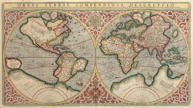
Mercator Map – Circa 1587
That is a map. It is an old map. At the time of this writing, you can buy this map for 8,500 Euros. If you want to get anywhere, I don’t recommend it though. Turns out, it’s wrong. Pretty and expensive, but wrong. We do the same thing with software, but those pieces of pretty, but dysfunctional software tend to get found out pretty quickly. Then, we are left with something that looks good, but doesn’t do any good.
Over the past few years, I kept thinking how we needed to improve the user interface (UI) in corporate software. Usability should be tied to to the visual allure, making tools more attractive to users. It turns out I was wrong. While it’s true users would like something simple, with clean lines and calming, or exciting, colours, they unanimously want something that works, and works efficiently first. They want something that presents what they need to see in a logical manner without fluff. Well, maybe some fluff. Google search is the paragon of simplicity, but people still love the distractions of the logo changing and even becoming a game from time to time. I just spent a few entertaining minutes going through Google Easter eggs myself. Ok, it was two hours, but that only proves my point!
Today, I caught myself thinking about new web sites we have at work. They are pretty and the design is very “clean”. Nice big buttons with a Windows tile-like organization. The problem is that 80% of the screen is empty space, the buttons are too big, we have to scroll too much and, to top it all off, it is slower than the old site. So, not only are we stuck going through the pangs of change, but we have to contend with annoying scrolling and fidgety sub-menus to get anywhere. It seems to be made for a tablet, easy to scroll and big buttons for fat fingers. The issue is that most of us work on a laptop. Viewing that page on a 14″ screen makes it look like I was only supposed to see the first menu. Then scroll, scroll, scroll and, OMG!, I found something! Ok, I may be exaggerating for effect, but that’s not far off. Then, we get in to the functionality, which has been inexplicably reduced, or maybe I am just slow to find things. *Sigh*. I will stop here since you would have to see it for yourself to really understand and I am pretty sure my superiors and other corporate security types would have a problem with that.
So, trying to learn the lesson and apply it to my own little fiefdom of applications, I have started to question functionality. Does it do what it is supposed to? How fast does it do it? What is acceptable to the user? What is really acceptable, but they don’t realize it? Can we make a slimmer version with less fluff? How does it look on the screen of an average user? All these seem like logical questions and we all begin with the mantra of wanting to serve our customer. But, over time, we start to adopt the Steve Jobs attitude of “customers don’t know what they want”. This, again, is only partially right. With innovation, I do believe that customers can be completely ignorant of what’s next and why it’s important. In the end though, we end up figuring it out and more. We, the customers, end up developing the next big thing by feeding back in to the system (#hashtags), mashing up the technology or even starting our own companies because we think we know better and can do better. We become the makers.
Let’s just hope that, in the end, we learn our lesson and develop function first. Or, even better, go out and make an altogether different dent in the universe.


 In computer networks, connectivity is key. If your computer is not connected to a network, you are pretty limited. The amount you can do is generally proportional to the nodes you can talk to. This is the beauty and power of the internet. Our work and personal lives are the same. We need people around us, some close and some farther away, to do great things.